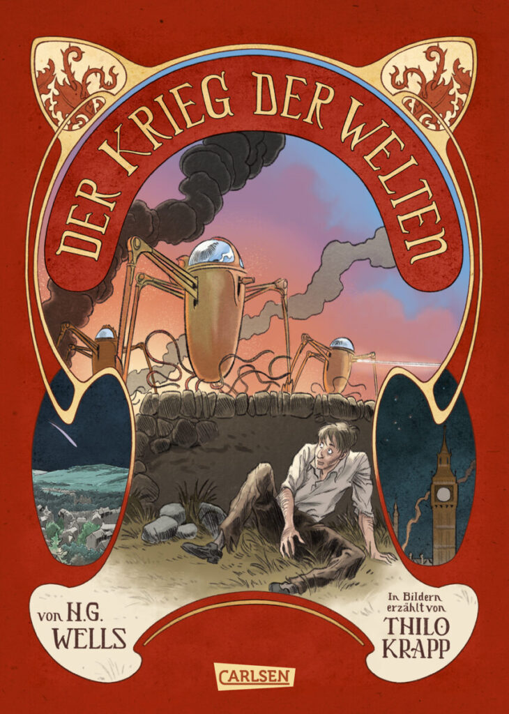


For the new German edition of my graphic novel based on H.G. Wells THE WAR OF THE WORLDS, publisher Carlsen and I agreed on a translation of the colored French edition from summer 2020, which was published by Steinkis / Éditions Jungle.
For this French edition, the original version, which Egmont published in sepia tones in 2017, was carefully colored in a slightly desaturated four-color scheme by Xavi M. Montell in consultation with me. Xavi did a great job! His color key, matching very good the epoch in which the story takes place, gives the graphic novel a wonderfuly different expressiveness than the sepia edition. For the four-color version at Carlsen based on this, I took the opportunity to bring back something of my inking in two or three cases, which had been covered a bit by a coloring effect (in the time that we had to give the book an appropriately colored garment for France, Xavi and I hadn’t been able to pay any more attention to it than we were already doing). But I will not end this caption without saying and emphasizing how much I stand (and stood) completely behind Xavi’s work and how grateful I am for waht he did for the book – he really did a great service with the mammoth task of coloring.
But you still take advantage of opportunities when they show up, don’t you? And here it did and felt like a good idea to readjust something again. In the scene above, where the Martians attack London, on the page with Tower Bridge, you can see how I brought some of my old outlines back into the “foreground”, which ‘stepped’ a little more into the background in the French edition (1st picture). I did not do this because I am vain and I think my outlines are so absolutely great – I did it because in a medium like comics and the drawing style that I use as a draftsman within it, the outlines as meaningful, in my eyes, to the plot and its understanding :).
I am very happy with the result and the resulting printing of the new German color edition at Carlsen. It turned out really very beautiful.

