
As an illustrator, it is in fact a duty to progress throughout your professional lifetime. There is always something to learn – new software, new laws and their effects on your work or your internet performance, new social media functions – and of course new illustrating skills.
I‘ve been loving gouache colors – alongside watercolors – for many years now, and it is a constant learning process to work with them. They interest me. So whenever there seems a small slot of time open for learning new things, I gratefully give in and dive into working with them.
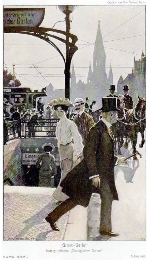
I stumbled upon this motif of a turn-of-the-century illustration of an early morning (?) hour at the Berlin Kudamm in a catalogue of a former big department store, the Nathan Israel store in Berlin. It was one of the biggest and most renowned department stores in the city. During the Third Reich, it was, along with many, many other stores run by jewish owners, seized by Nazi Germany and subsequently destroyed in Word War II. That there are so many things no more – we own that to the stupid Nazis.
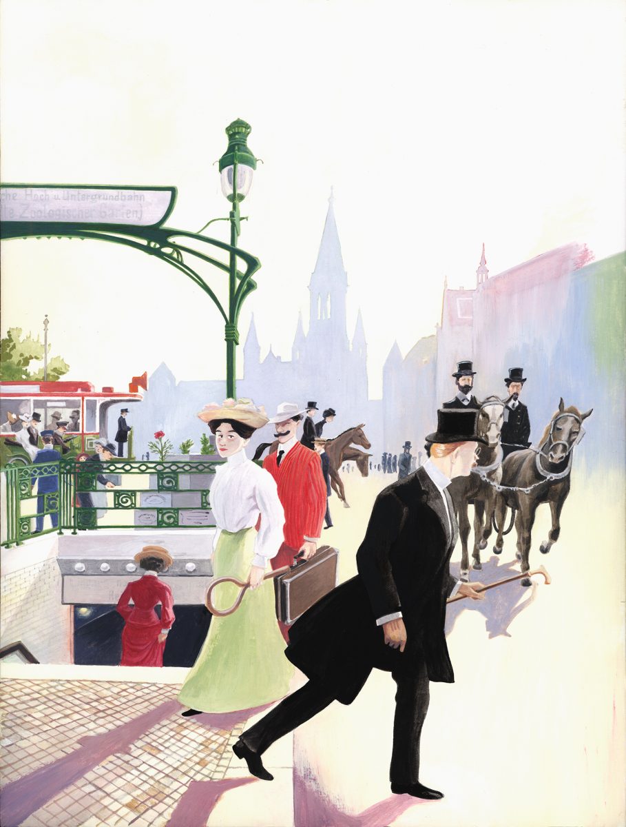
The Nathan Israel department store had, like most other stores, a lot of advertising stuff to promote it‘s business. One of them was an annual catalogue, which was sort of a calendar enriched with recipes, recommendations for local shows and theatre productions, articles about this and that and of course ads for the store itself. But it was also illustrated here and there with general pictures of everyday life in Berlin or in the store. Otto Marcus, a Berlin based illustrator (like me :)), worked for the 1904 catalogue and came up with this beautiful idea of a scene at the then-new underground station ‘Zoologischer Garten‘ at the most famous Boulevard in Berlin, the Kurfürstendamm (or ‘Kudamm‘, as we Berliners say shortly). The station was designed in a decent but striking art nouveau fashion by the Berlin subway station designer genius Alfred Grenander. You can still observe a lot of his work for this transport system throughout the whole city, unfortunately the stations in the design depicted here didn‘t survive until today.
When I first saw this illustration, I immediately fell for it. I mean – the well-thought out, entwined action of all the people in the original motif (seen at the bottom of the pictures above)… there seems to be a story between everyone of them, also in the background… the cleverly positioned elegant art nouveau architecture of the station, structuring the picture… the dizzy background showing the old Kaiser Wilhelm-Memorial Church in it‘s full prominence – he really did a great job, didn‘t he? Also, a lot of transport means are shown here, he didn‘t exclude anything: Horses, streetcars and even a car in the background on the left!
I was intrigued and decided to develop my gouache skills further on this topic.
In the following, I give you an overview of my working process on the copy of the Marcus motif. For this, I have made several step scans of the working process that can be seen here in chronological order from top to bottom – while the last picture, as stated above, shows the source to compare with my result, the top picture that shows the final state just to let you know what the goal was before going on reading.
The next step is the initiate preliminary drawing I made on a Guardi Artistico paper bloc suitable for painting on with Acrylics. I had to recompose the Marcus composition because I had another format – that meant that the jammed crowd scene had the chance to become a little bit more airy. I gladly gave into that. I‘m a fan of negative space in pictures, if it‘s done the in the right way. Not that I did it all right! But according to my opinion, it‘s better to leave a blank space in a picture before you frantically fill it up with detail that makes no sense. And I loved the idea that the man in the black suit in the foreground hastily steps into ‘open space‘, just in time to cross the street before the horse-drawn wagon comes too close.
The next step was to settle some basic colors in the background – a classic way of building up a painting (working from the background to the foreground). The bloc was suitable for taking up light weights of watercolor, so I used that for this step.
The next step makes a leap forward. I maybe should‘ve made a scan inbetween – but you know, working on something in a flow-mode and having to interrupt yourself just for a scan… it didn‘t felt right. And it depicts the actual workflow, actually: After a ground settlement I made a first deep dive into giving everything real colors and modulation in some sort of a hours-long rush.
The next step had me refine some of the back- and foreground details and work out the foreground in general a bit more.
In the following and fourth step I returned to the background on the right again, clearing how to figure out the buildings… and drew the inscriptions on the subway signs, too!
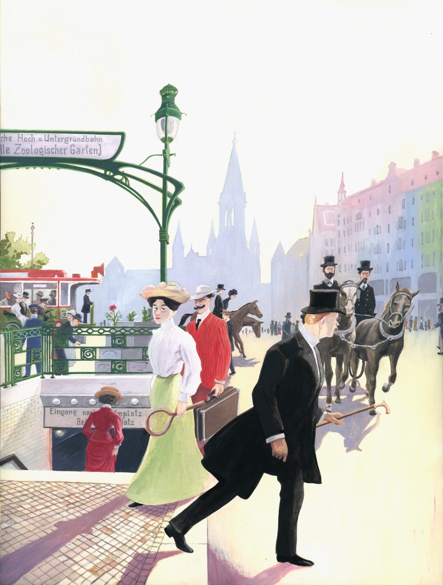
In the final step, I worked that background over with some detail and made some minor corrections and finishings here and there.
I didn‘t include the wiring of the streetcar and everything yet like in Marcus‘ painting. Maybe I‘ll do later, but for now I just liked it so much how it is that I wanted to stop. Maybe the picture just needs some days off before I return to it! 😀